Marianne and Mark's Nature-Inspired Wedding Suite

hudson valley vibes
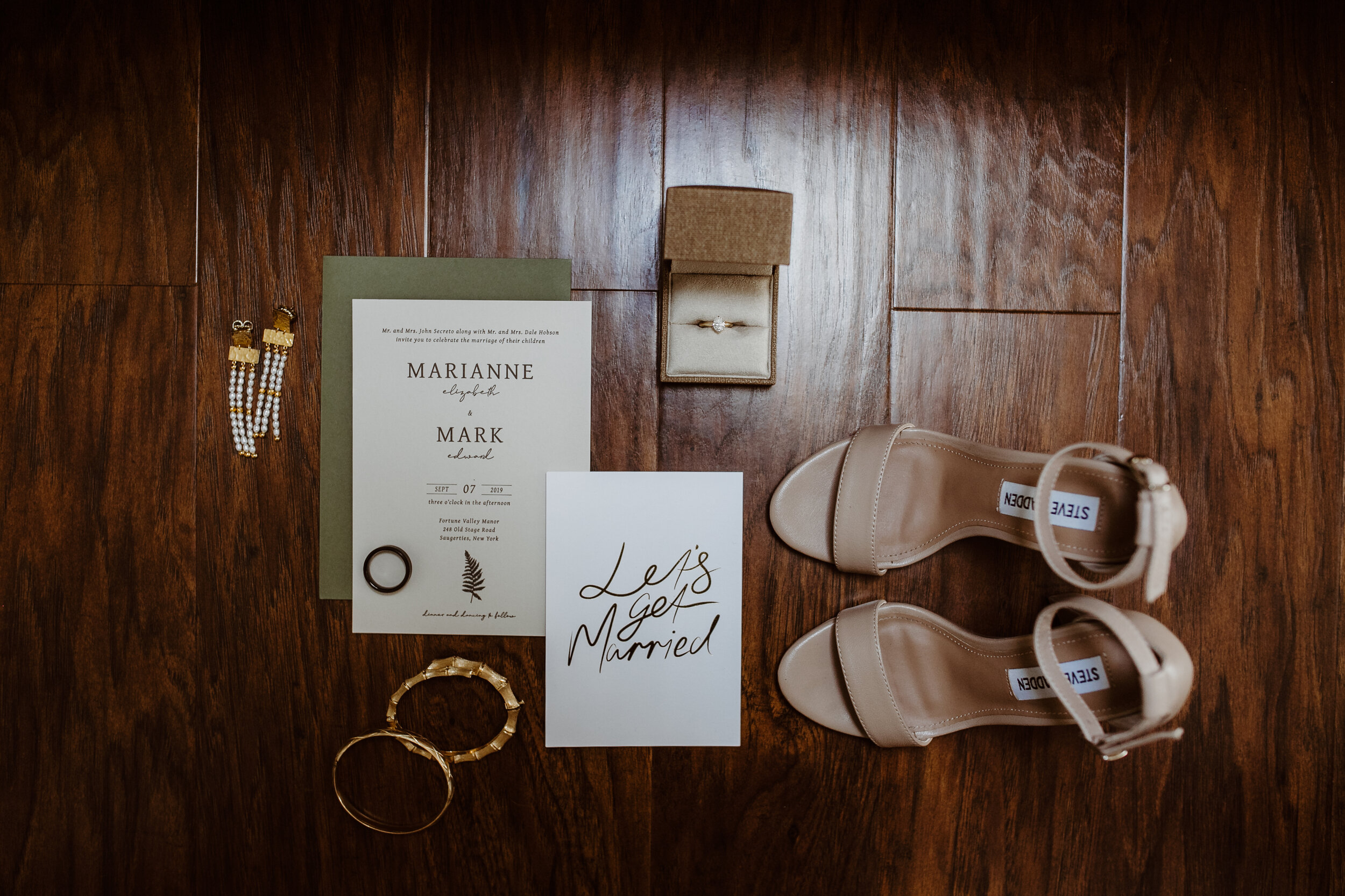
Marianne and Mark got married in the Hudson Valley of upstate New York and had a vision for their letterpress wedding stationery right from the start. Their venue featured a large, beautifully designed barn surrounded by fields of grass and a pretty little pond. It actually reminded me a ton of the property that my Nana had while I was growing up - which also happened to be a short 20 minutes from their venue. It was perfect in every way. They even had horses on the property. So, like I said, perfect. The gorgeous venue nestled upstate in Saugerties became the center of our inspiration. The landscape, paired with Marianne and Mark’s desire for a simple, timeless invitation style allowed me to get to work creating a suite that would become a favorite of mine for what I know will be years to come.
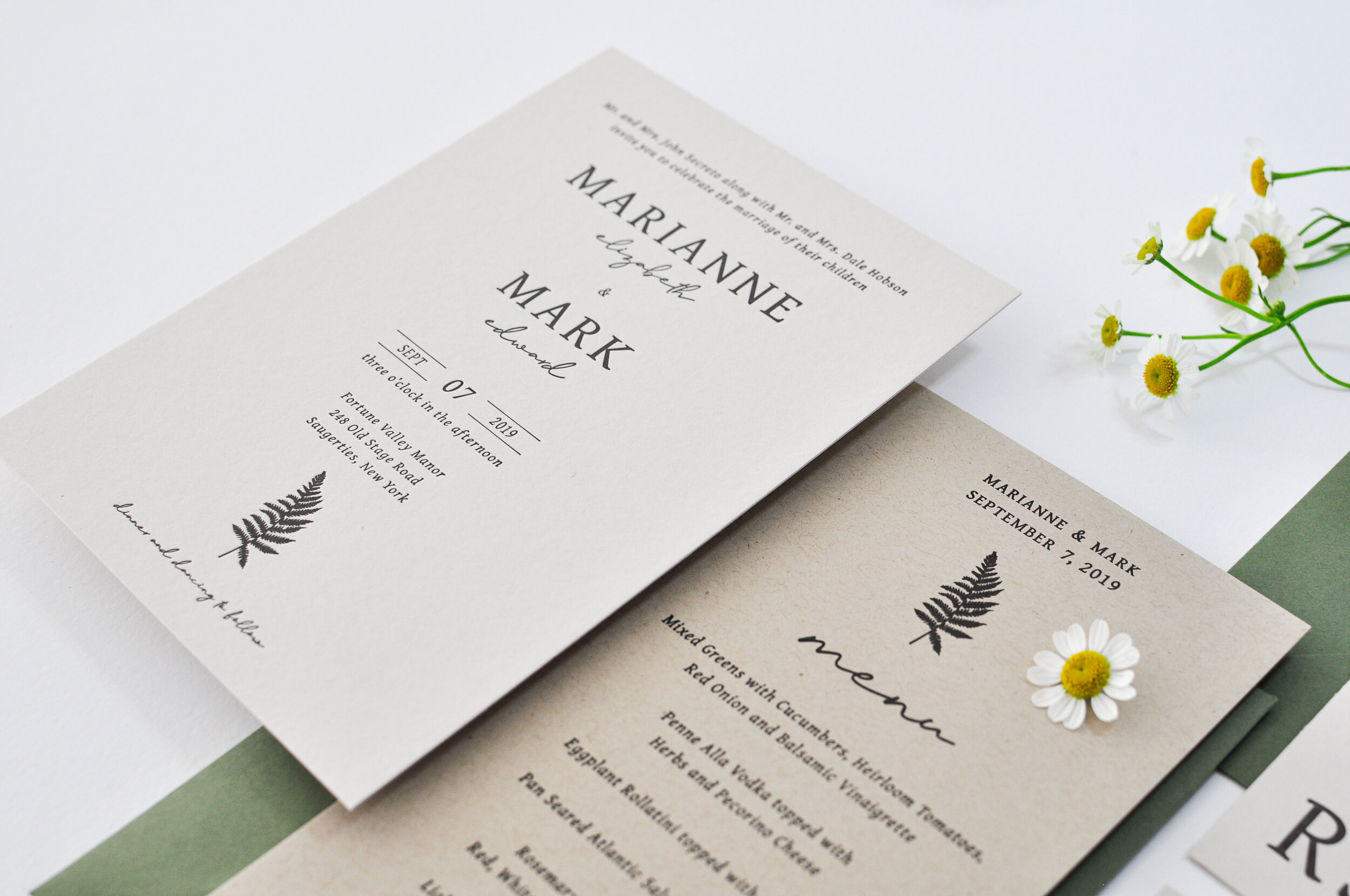
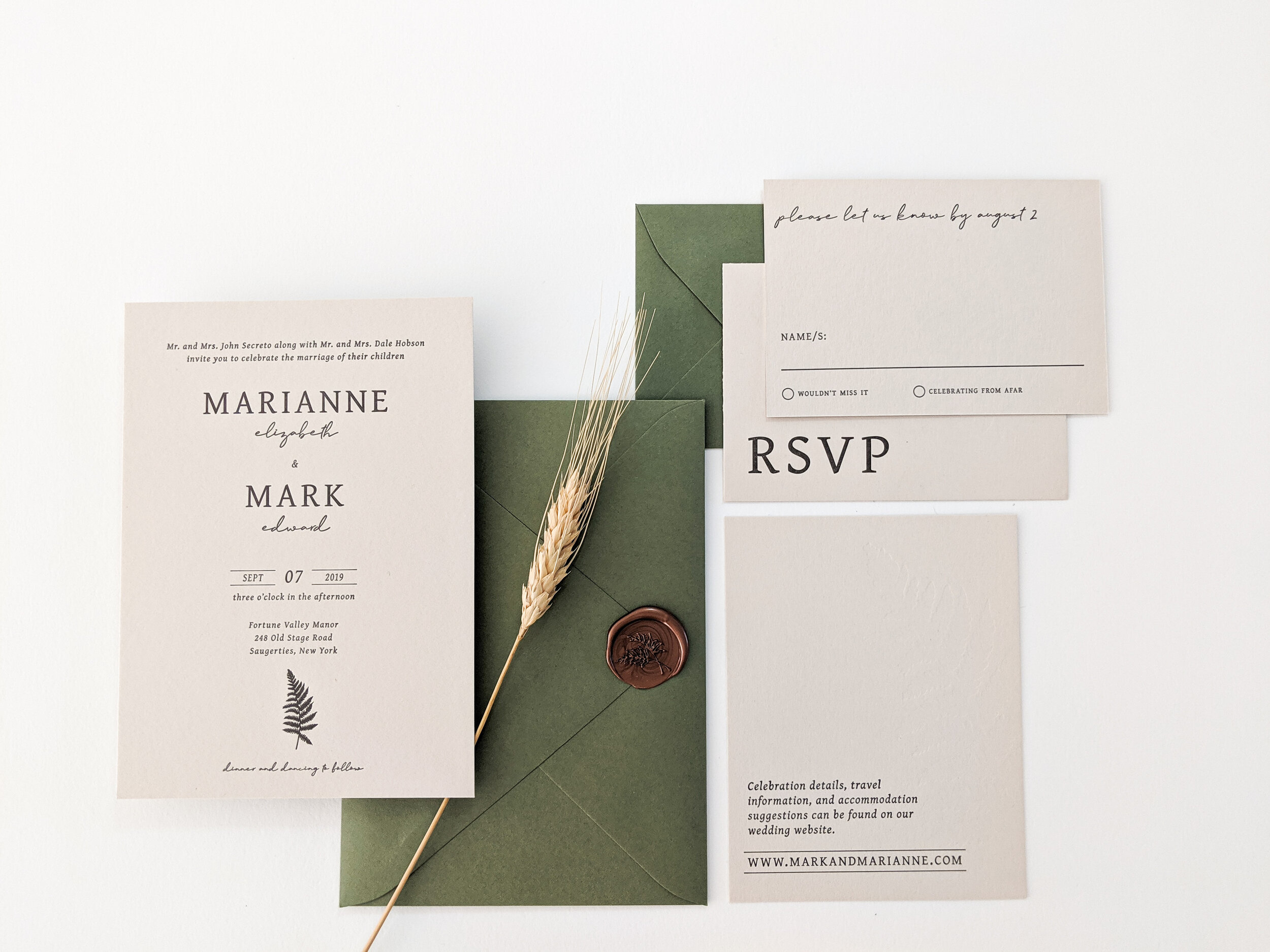
Right away, I had hoped to use colored paper with them. I was looking into earthy greens and neutrals to bring this suite to life. I met with Marianne in person to look over swatches together and we decided on this beautiful Colorplan Mist Cover Stock for the main suite elements. Between the fern elements and venue, we all agreed that these gorgeous green envelopes were the perfect way to bring in color. I was already so excited about these invites and then came the wax seals!! The joy I felt when Marianne said YES to wax seals was beyond words. Together we chose this GORRGEOUSSSSS SILKYYYY Antique Copper!!! ARE YOU KIDDING ME?!? I’m about to melt just thinking about them.
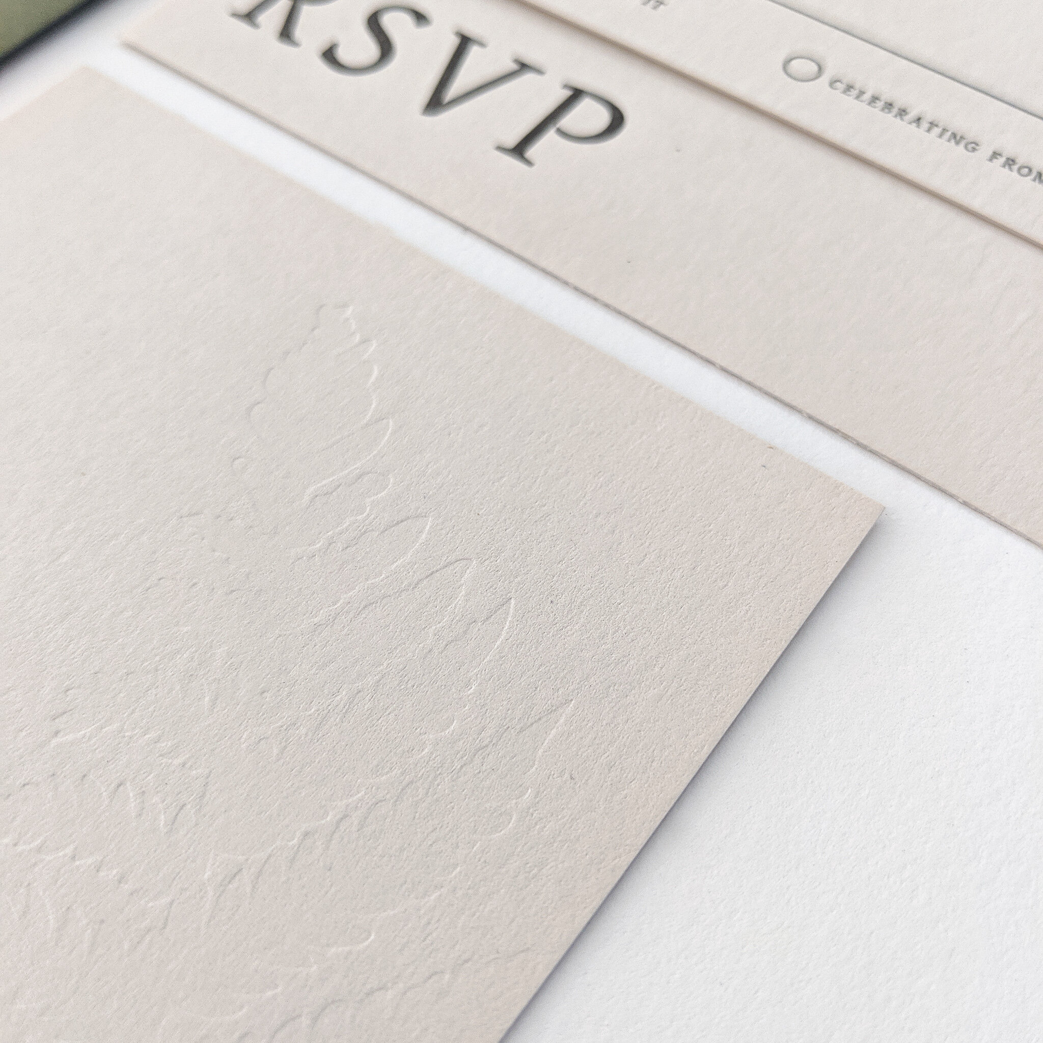
MOVING ON. The trickiest part of this suite was for sure the blind fern impression on the details card. For whatever reason, the packing took FOREVER to get just right. Press days can be like that - a lot of time spent trouble-shooting! Packing is what’s used to help with the depth and evenness of an impression. Packing is made up of typman paper, printer paper, tissue paper, as well as other materials - all of various weights to help aid in finding just the right thickness throughout an entire design. It took several hours, but eventually I found a mash up of packing that worked beautifully for the subtle, blind impression I was looking for!
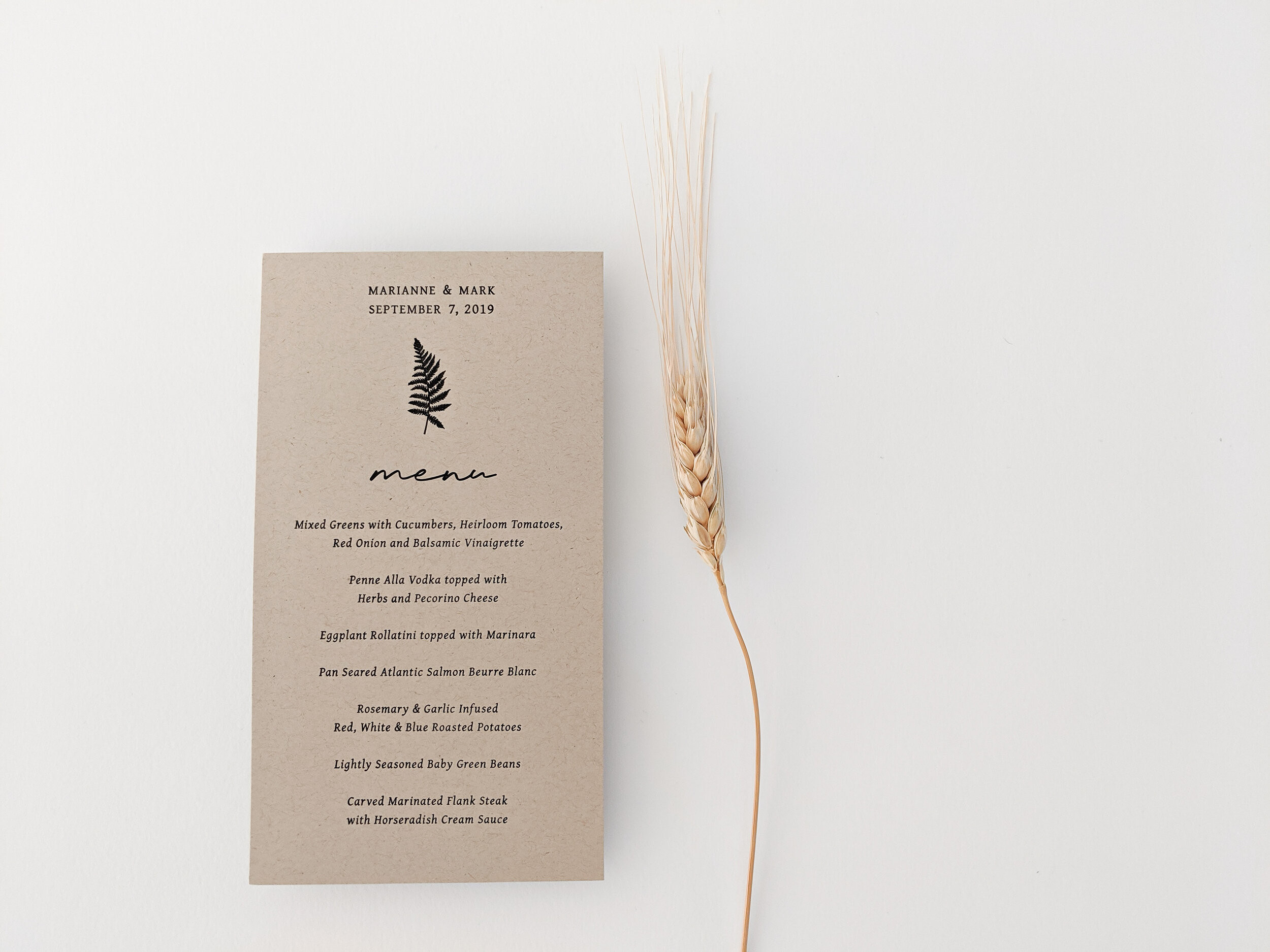
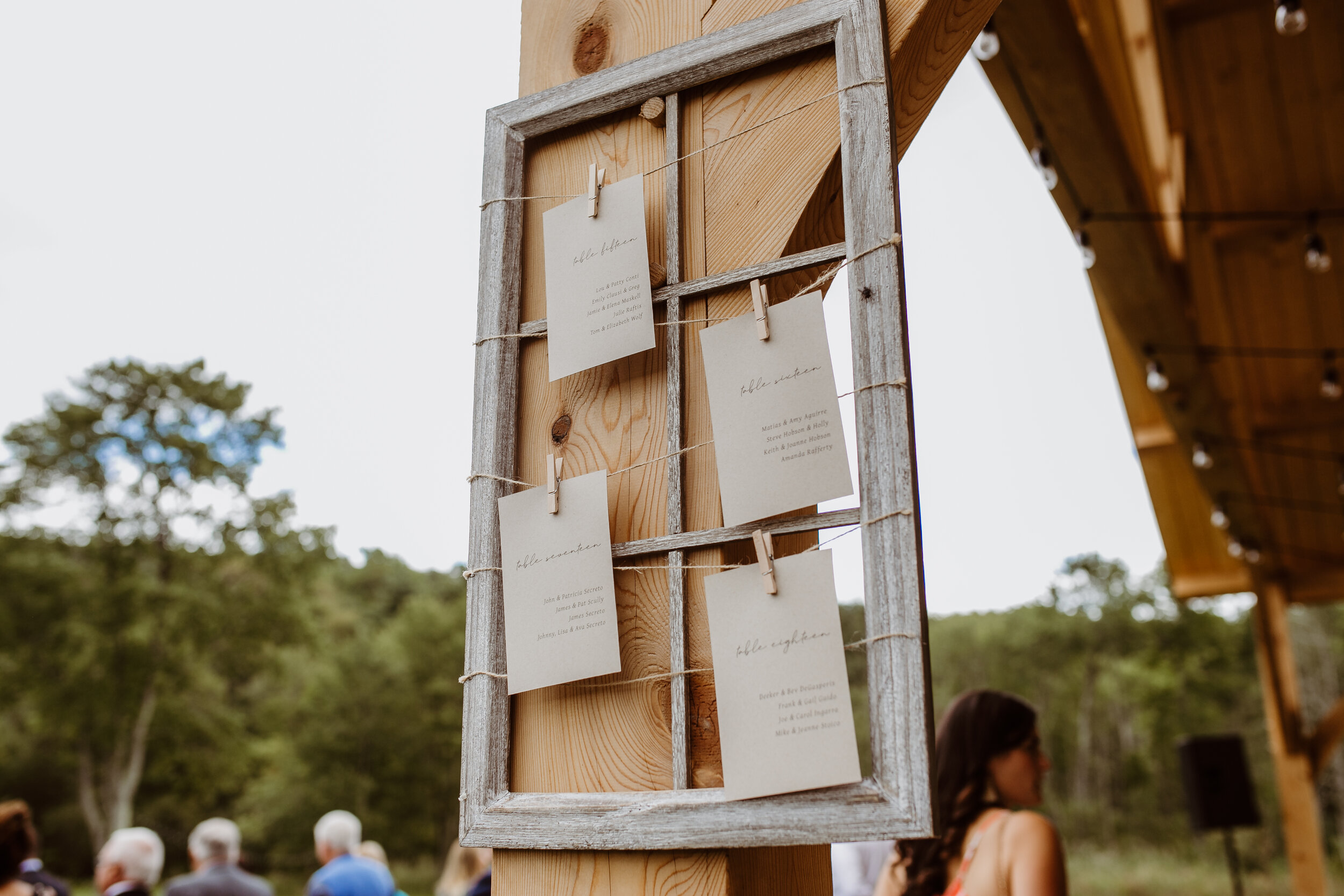
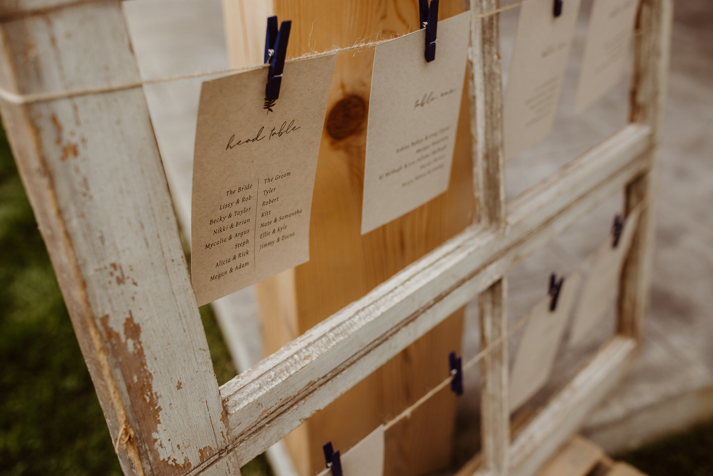
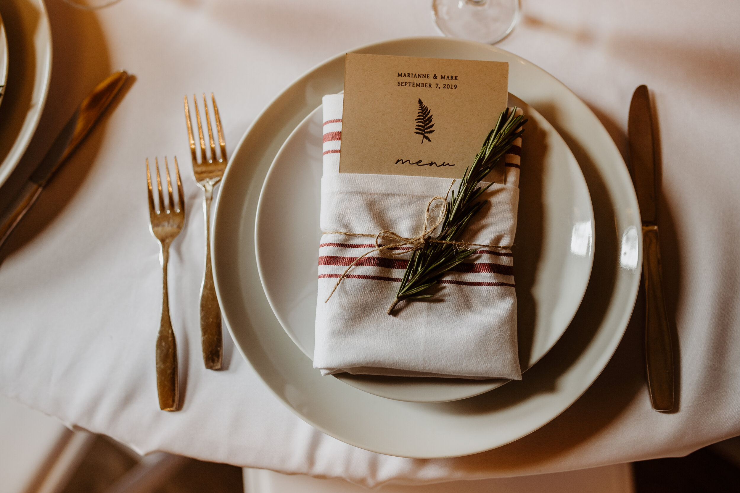
For day-of materials, we used our simple fern graphic and black ink to coordinate with the suite but switched up the paper to a kraft brown which felt super perfect inside the beautiful barn! The menus were printed on press and I was super happy with how the impressions came out! For our seating chart, we opted to flat print them, helping to save on cost and time - which is always something I like to consider with my couples for day-of items!
All said and done, Marianne and Mark’s wedding suite quickly became one of my absolute favorites and I’m so grateful to have been able to collaborate so closely with them throughout the entire custom process. The combination of the fonts, colors, paper choices, and style created an invitation suite that to me, is completely timeless. Yay! Check out some photos below!
stay pressed!
Letterpress Paper Goods: Lovelybones Paperie
Paper: Colorplan Papers
Envelopes: Cards and Pockets
Wax Seal: Artisaire
Professional Photos (Images 1 and 6-9): Lollipop Woods Photography
Wedding Venue: Fortune Valley Manor